
Sitecore
Sitecore is a leading enterprise digital experience platform (DXP), powering global websites through products like XM Cloud, Search, and Personalize. As a long-standing Platinum Partner, Hugo & Cat had supported Sitecore on numerous client engagements. But when Sitecore set out to reinvent their own website, they invited partners to pitch for the work — a rare opportunity to shape how a technology leader presents itself to the world.

Background
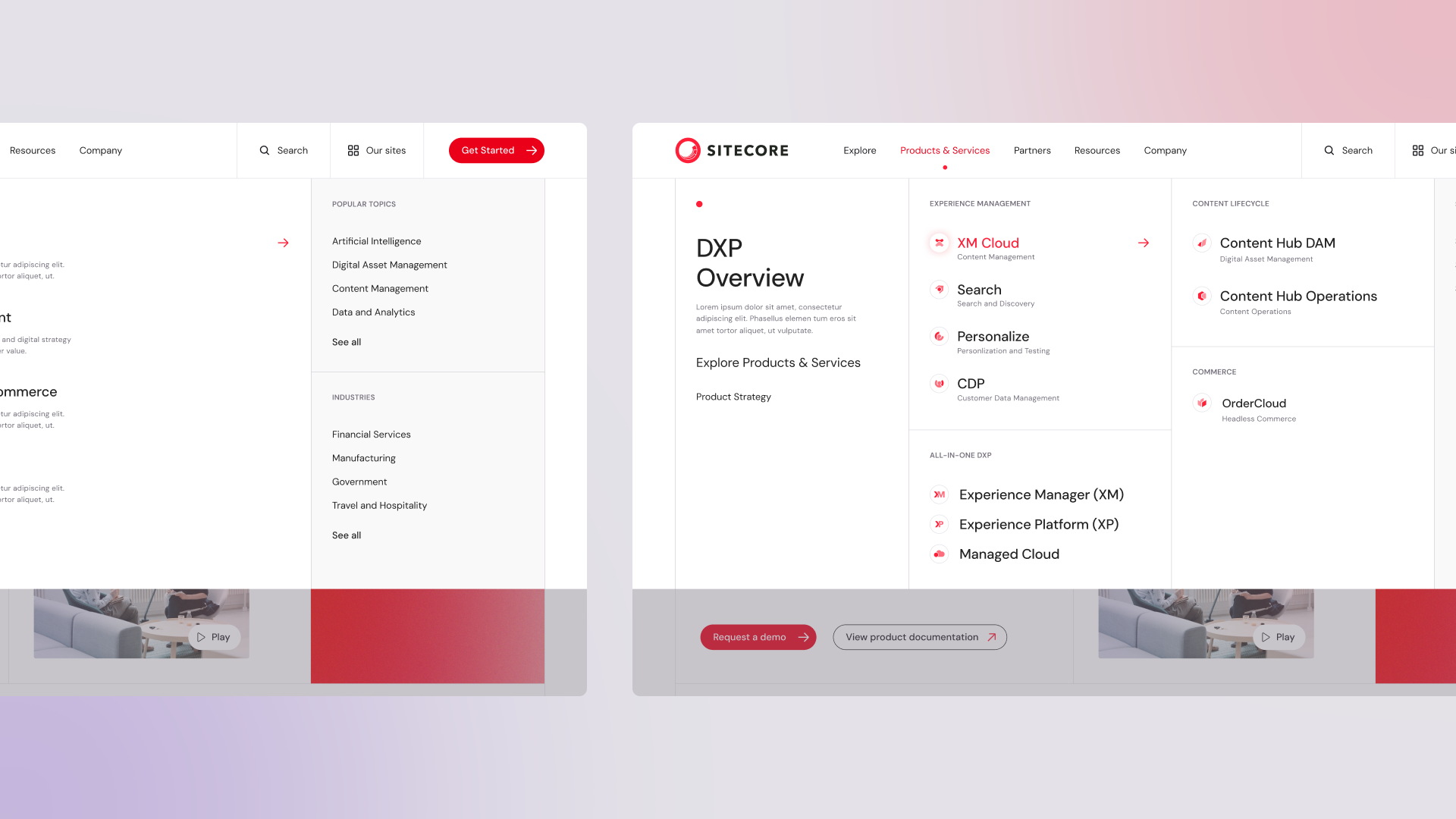
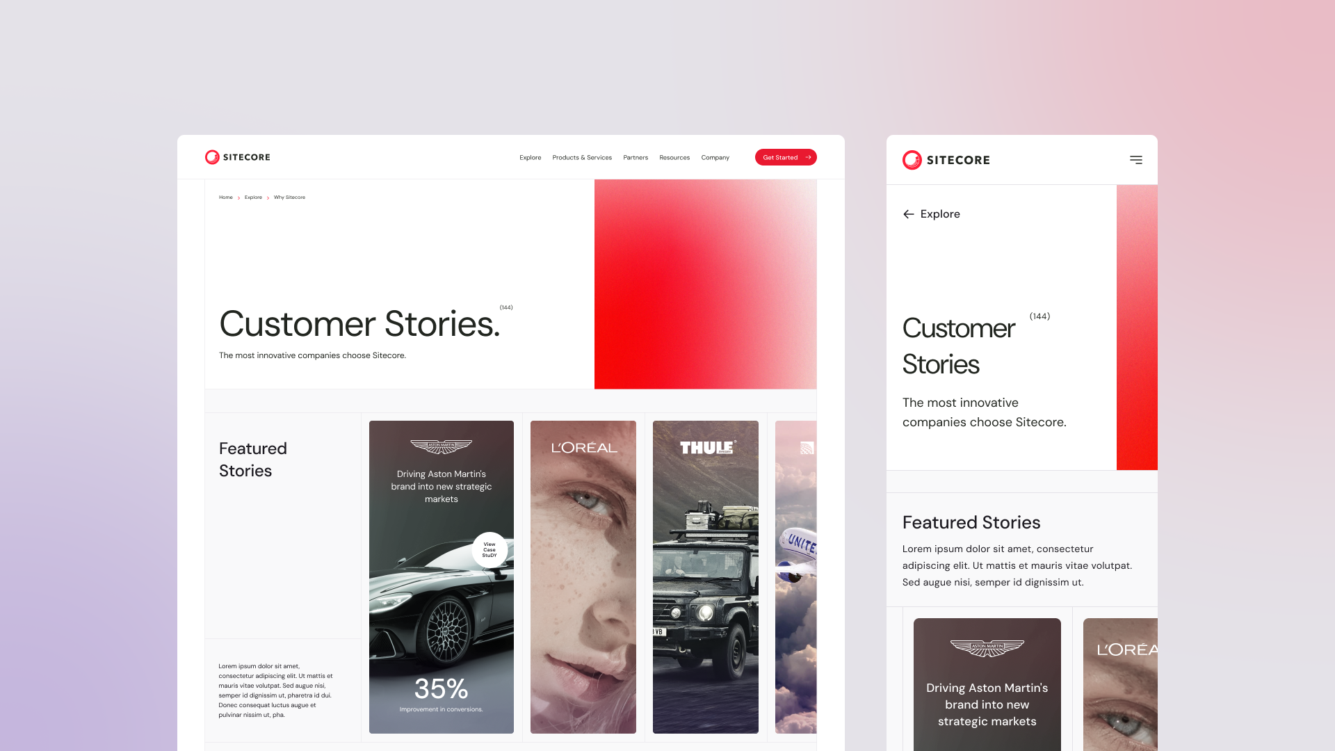
Following a successful competitive pitch, we were appointed to lead the redesign of Sitecore.com — initially framed as a pattern library and component refresh. But it quickly became clear that Sitecore needed more than new UI. The project expanded into a full experience strategy, information architecture overhaul, and visual brand evolution. I led UX across this effort, overseeing the experience strategy, structural planning, and design execution alongside a collaborative internal dev team at Sitecore.


Insight
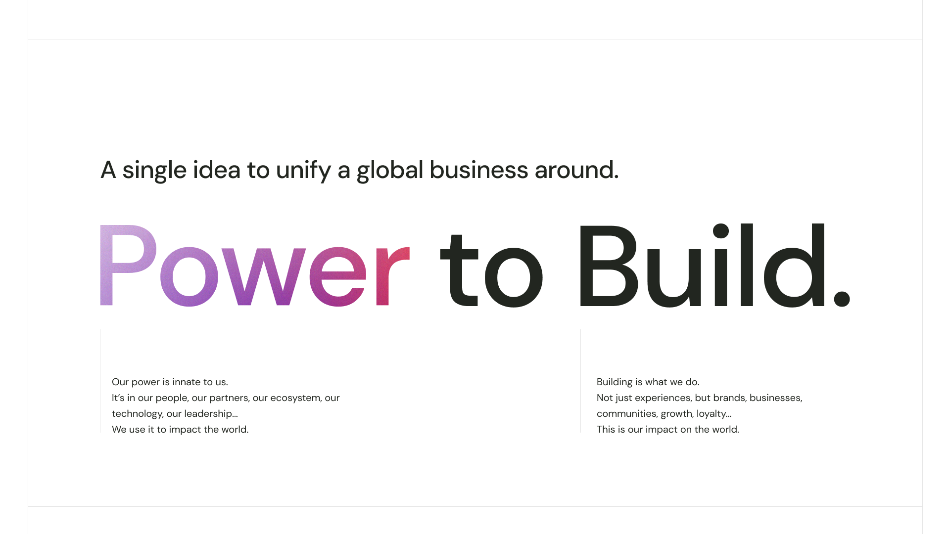
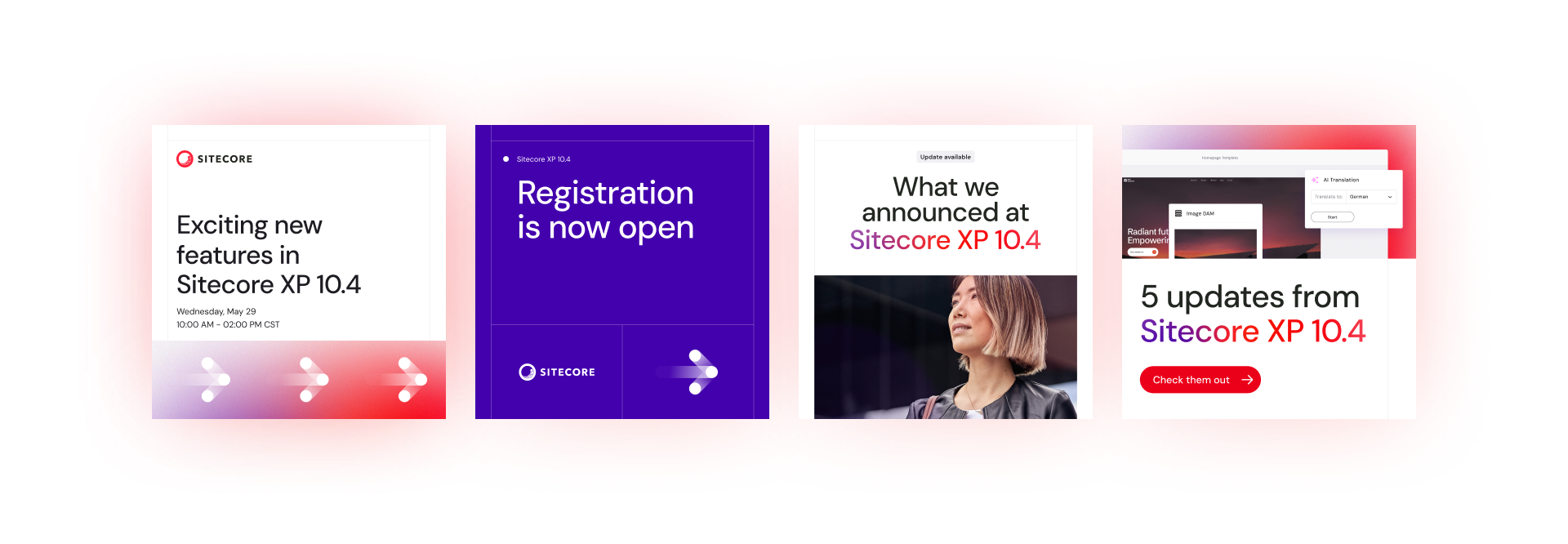
Our early strategic work helped Sitecore define a new positioning — “The Power to Build” — which reframed their platform as the invisible force behind customer experiences. This concept was expressed visually through a new design language based on modular grids and an abstract “power gradient.” It wasn’t just a tagline — it informed how we structured journeys, shaped modules, and planned page interactions across the site.
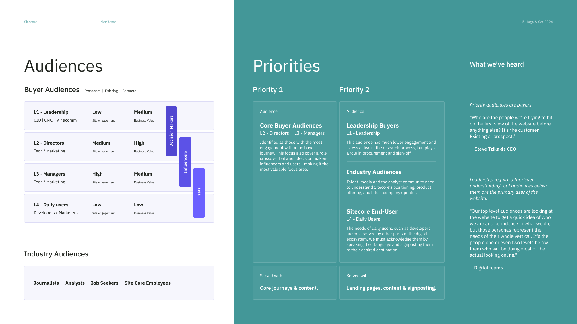
To support this, we created a Customer Journey Framework based on interviews, analytics and experience mapping. Rather than mapping traditional funnel stages, we focused on user missions — the real reasons people come to a platform site — and used those to inform page types, messaging strategy, and prioritised content design.
A complete content audit followed, reducing tens of thousands of legacy URLs to a manageable ecosystem. We restructured the site using IA activities like card sorting and tree testing, reorganising product information around user needs, not internal structures.


“Hugo & Cat expressed our identity better than we've ever been able to. It gave me goosebumps.”
— Kathie Johnson, CMO Sitecore
Result
The final experience was delivered in an agile sprint model, with close collaboration between our design team and Sitecore’s in-house developers. Page templates, content modules, and journeys were prioritised and designed in sync with development — allowing us to launch the entire site in just a few months, an extraordinary timeline for a global enterprise CMS.
Beyond the site, our work extended into branding, conference materials, launch assets and a keynote film for Sitecore’s global brand symposium — turning a web project into a pivotal brand relaunch.
Increase in page views per user
+38%
Longer average sessions per user
+22%
Higher engagement rate
+9%
Good stuff
It’s rare to redesign the site of a company whose product is digital experience. This was more than a website — it was Sitecore’s own best use case, delivered through deep partnership and strategic clarity.

Sitecore Brand & Digital Experience
Date: 2024
Company: Sitecore
Project: Digital Brand evolution, Website redesign.
Role: UX / UI Design oversight, Experience design strategy,
Team:
Dan Simkins (Design)
Matt Molloy (Visual Design)
Charlie Harding (Visual Design)
Amy Deng (Visual Design)
Matt Malindine (UX Design)
Mark Mathieson (Motion Design)
Pao-Han Chen (Motion Design)
Philip Kassapian (Account Director)
Louise Kirk (Project Management)